Last week we identified the brand aligned visual of “JP”. I encouraged you to take a look at the collection and to ask yourself if you could see her wearing the pieces. Hope you had fun! And perhaps, if this is your style, you found a few pieces for yourself while perusing!!
If you haven’t had time to take a look before this moment, take off your shoes, pour yourself a glass of water, add a thin slice of lemon and imagine being at the beach while you check out:
http://www.jamesperse.com/women/landingPage.do?categoryId=cat20004
For the most part, the women’s Spring 2013 collection is spot on. I can see “her” wearing these pieces. And when I say “her”, I mean our brand character, not the target customer. However, I did find a few “off brand” pieces.
While I can totally see our Southern California casual lifestyle brand heroine wearing an easy shirt, the item below is not JP’s style. “Why” you ask? The plaid and it’s color way are not in alignment with the contemporary, clean, modern, quiet style upon which James Perse has built his brand.

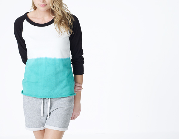
In addition, the following baseball shirt is a glaring mis-step. While fab, I would not have expected to see this item in the collection. While the silhouette is James Perse, the color way does not convey the simple and clean essence of JP.
These are 2 off brand items. There are a couple of others. Can you identify them? Most of the Women’s 2013 Spring collection is in alignment with the position and true to James Perse. I give the design team an A -.
In a few days, we’ll take a look at JP’s home. Where she lives and what this tells us.
More to follow…….soon!
